
Burger house is an interesting fusion between the classic American hamburgers combined with the authenticity of the best Iberian meat.
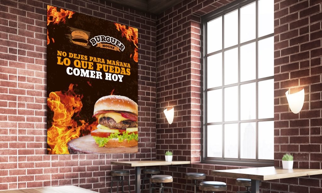
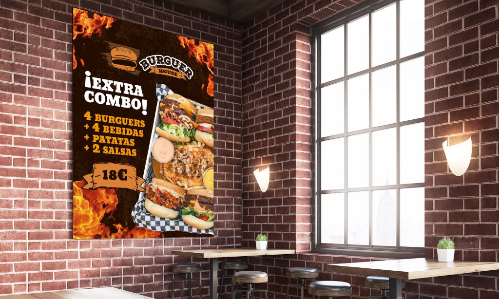
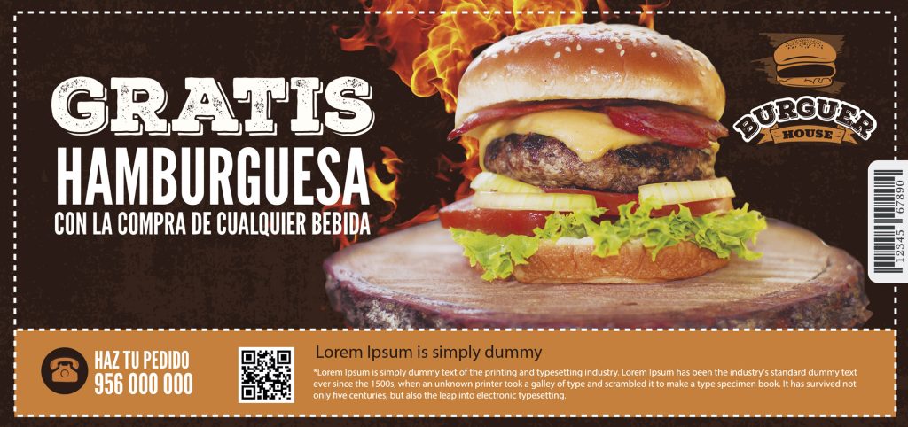
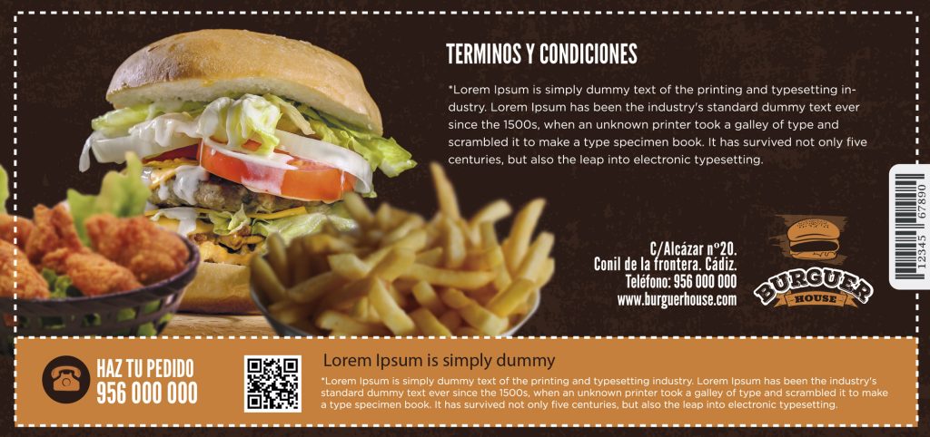
Following the American style, but without altering the quality of the product (what you see is what you eat, no dissapointing) several of advertising material and signage is created to advertise offers and promotions in online and offline media.
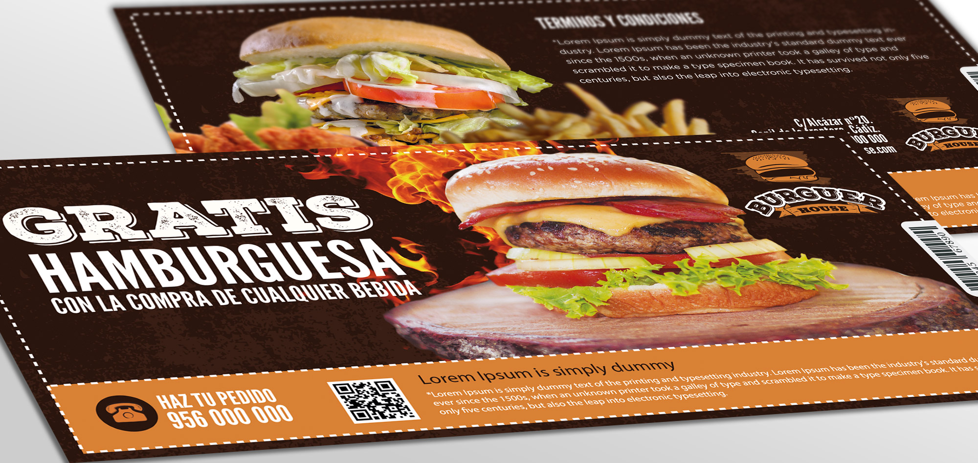
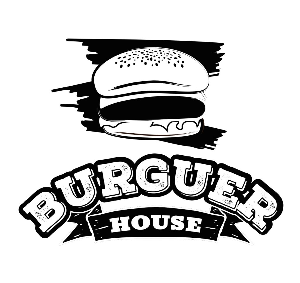
Corporate image development for a new hamburger restaurant, merging the traditional values of American hamburger restaurants along with rural touches, the latter point prevailing over the former when it comes to highlighting one or the other. With these two premises, I began to follow up on these two approaches and selected the most striking visual characteristics of both. On the one hand, the closeness and vitality transmitted by the American hamburger restaurants of the 80s and 90s, and on the other hand, the quality and reliability offered by rural products in the gastronomic field.
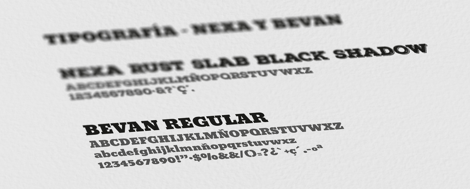
From the beginning it was clear that the typography had to be of a considerable thickness, without contrasts in its outline to follow the line of the rustic side. For this reason we chose 2 similar typographies in this aspect but with a subtle difference in the texture.
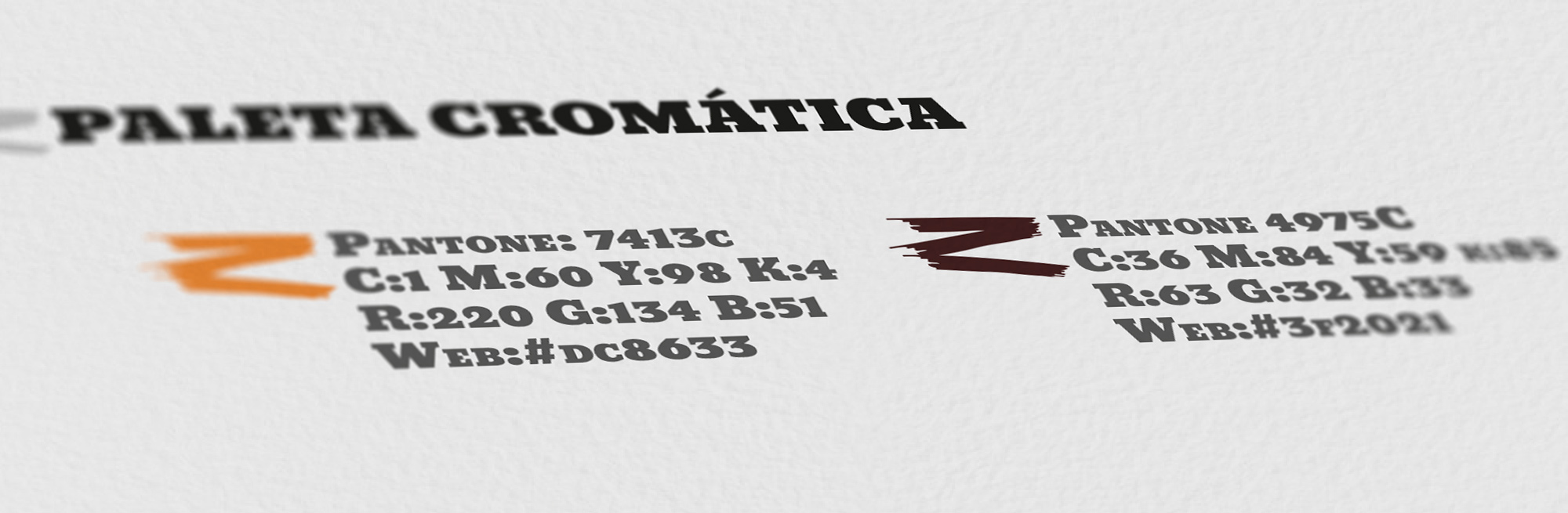
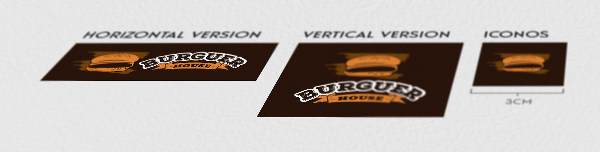
As for the colors, I wanted to choose 2 high contrast tones, to transmit more strength, linked to the rustic side, so we chose a very dark brown tone in reference to the wood and earth, along with an orange tone, in reference to the fire.
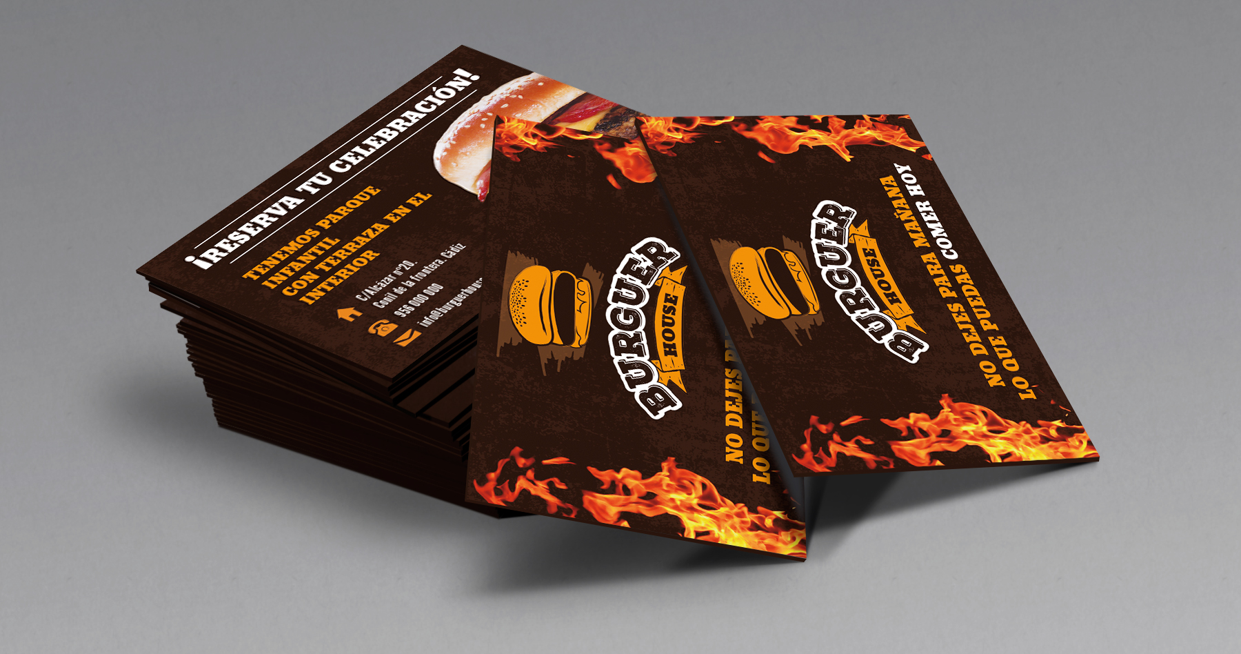
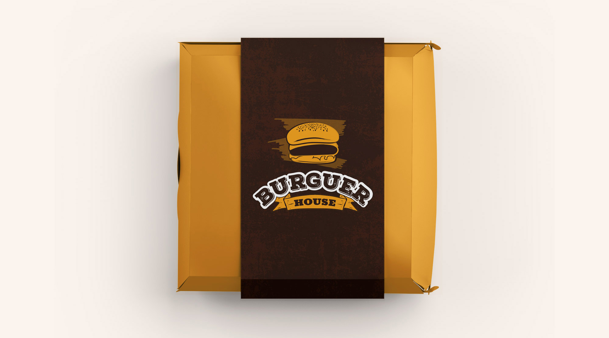
In the application of its image in different supports we used a worn background texture and images of fire and flames in reference to traditional cuisine, grilled or charcoal cooking, very present in the dishes they offer.