
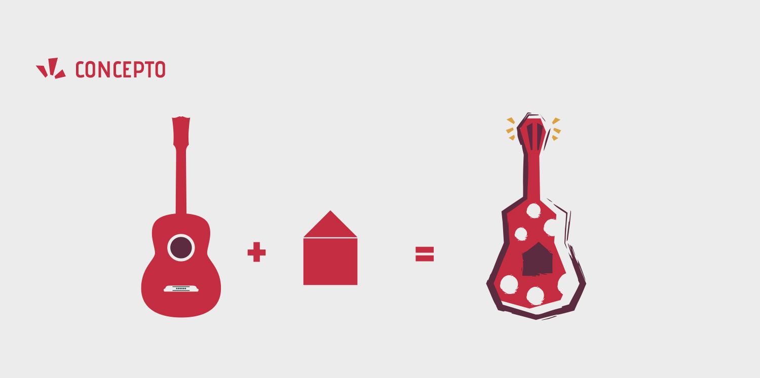
It was necessary to be very clear in the visual message for Casa Flamenca, avoiding local symbologies since the target audience is foreign, so I chose the most representative of flamenco, a guitar, with a very marked style, showing the strength and feeling of this art.
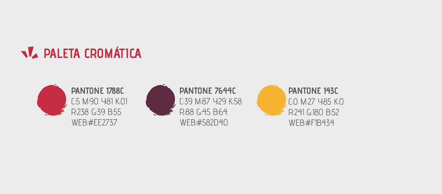
A palette of colors was chosen to represent the sentimental factor and the Hispanic culture linked to the art of flamenco.
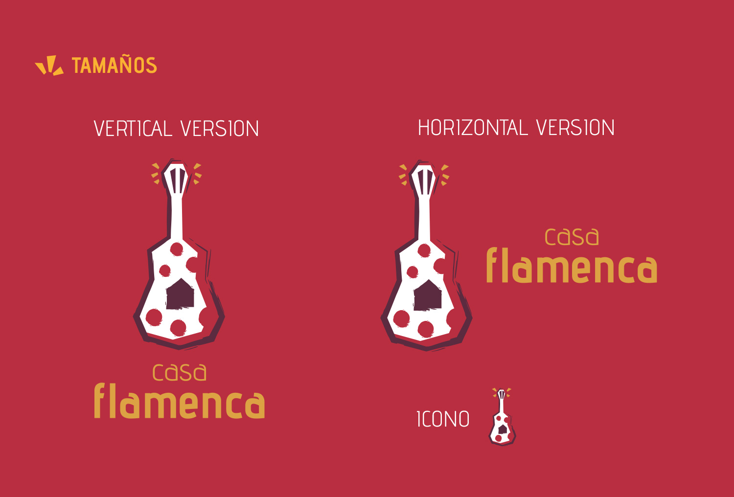
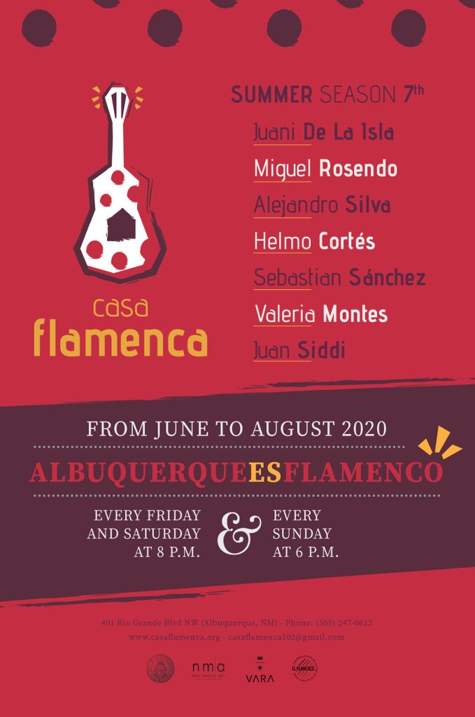
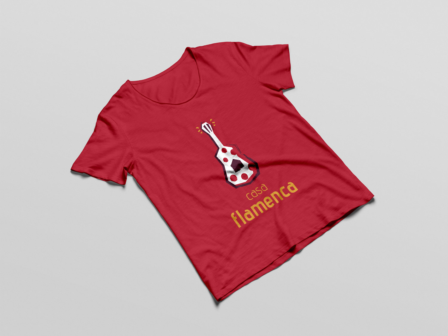
Proposal submitted for the new visual identity of “Casa Flamenca”, an event organization whose mission is to teach and preserve the art of flamenco, located in Albuquerque (New Mexico). In the initial proposals I wanted to follow a very expressive line in the typography, to convey the passion and feeling of flamenco, but I had to take a step back, since the target audience is English-speaking and the priority was to communicate in a very clear and fast way the activity and the shows that are performed.
For this reason we chose to use very identifiable forms, without using analogies that could confuse the user. We opted for a guitar with very marked strokes and angles that conveyed strength and strength.
As for the color, we chose tones linked to the passion and joy of flamenco and Hispanic history, with more weight given to the most emotional tone, red, as opposed to white and yellow.