Laundrylan – Laundry services marketplace

Laundrylan - logotype
Logo for Australian marketplace for laundry services.
Laundrylan - positive logo
Positive logo
Laundrylan - negative logo
Negative logo
Laundrylan - gray scale logo
Gray scale logo
Laundrylan - Color palette
Color palette chosen, with blue tones that symbolize neatness and cleanliness, achieving a strong contrast between them to transmit more strength and harmony to the whole.
Laundrylan - Typography
Typography with a lot of strength, transmitted in the thickness, avoiding serifs to achieve a perception with modern and new technologies. The rounded corners relax the authority, making it more friendly.
Laundrylan - Print sizes
Different versions of the logo depending on the size to be presented, either in print or on screen.
Laundrylan - Security area
Security area, which under no circumstances may be exceeded by another graphic element.
Web
Web in desktop version.
tablet
Tablet version of the website.
Mobile phone
Smartphone version of the website.
Laundrylan - Cards
Cards
Laundrylan - Advertising
Online ad for platforms such as Facebook or Adwords, focused on customers looking for laundry services.
Laundrylan - advertising
Online advertisement for platforms such as Facebook or Adwords, focused on recruiting Laundry workers.

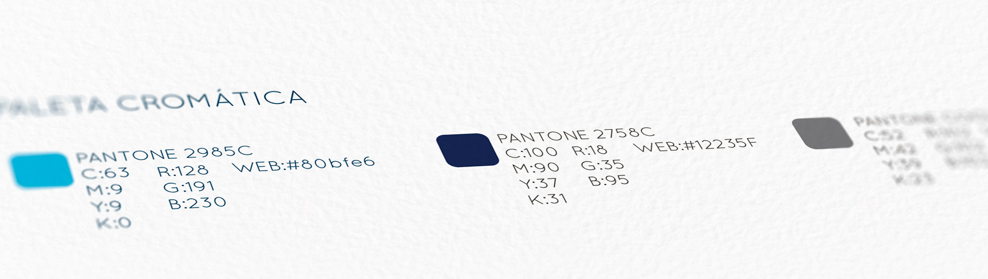
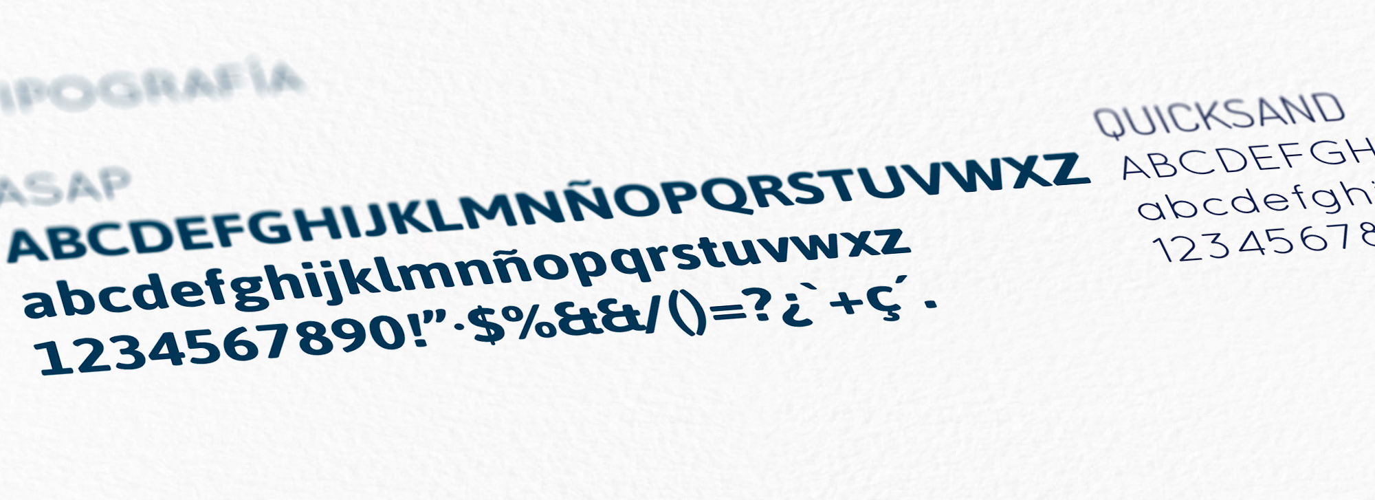
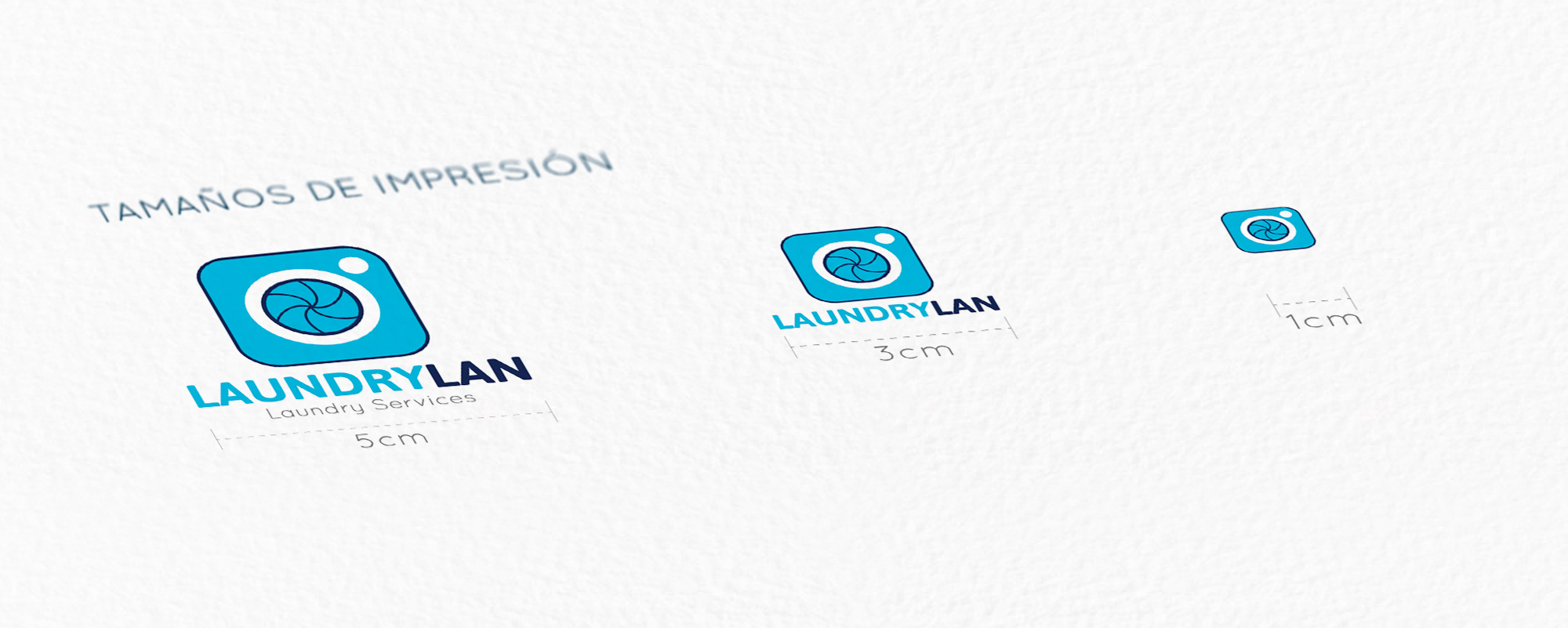
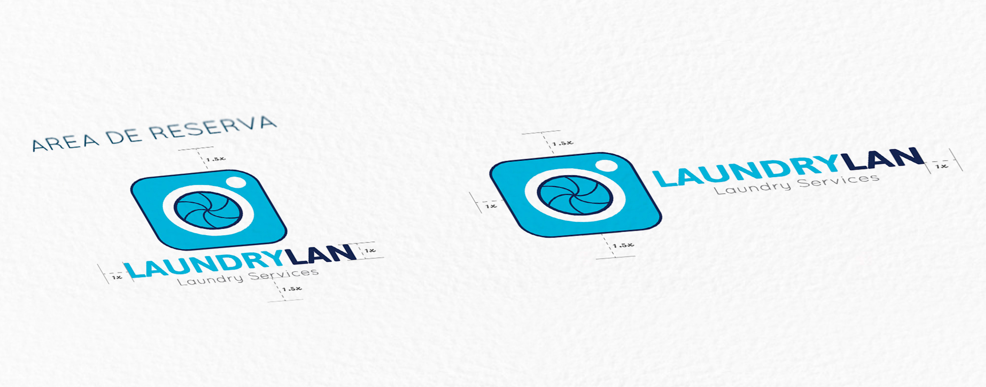
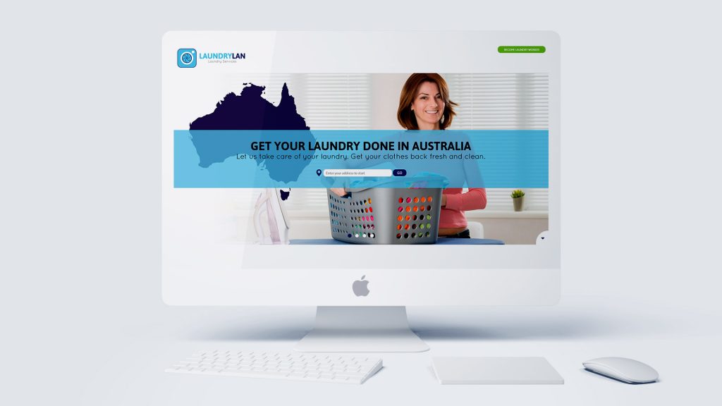
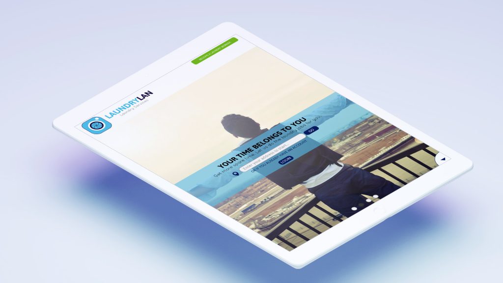
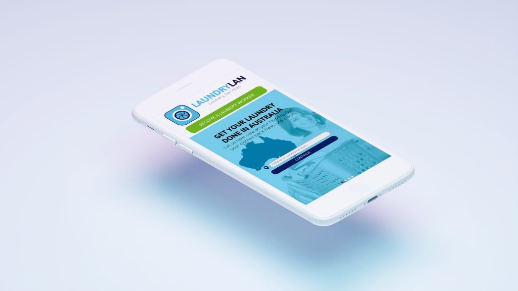
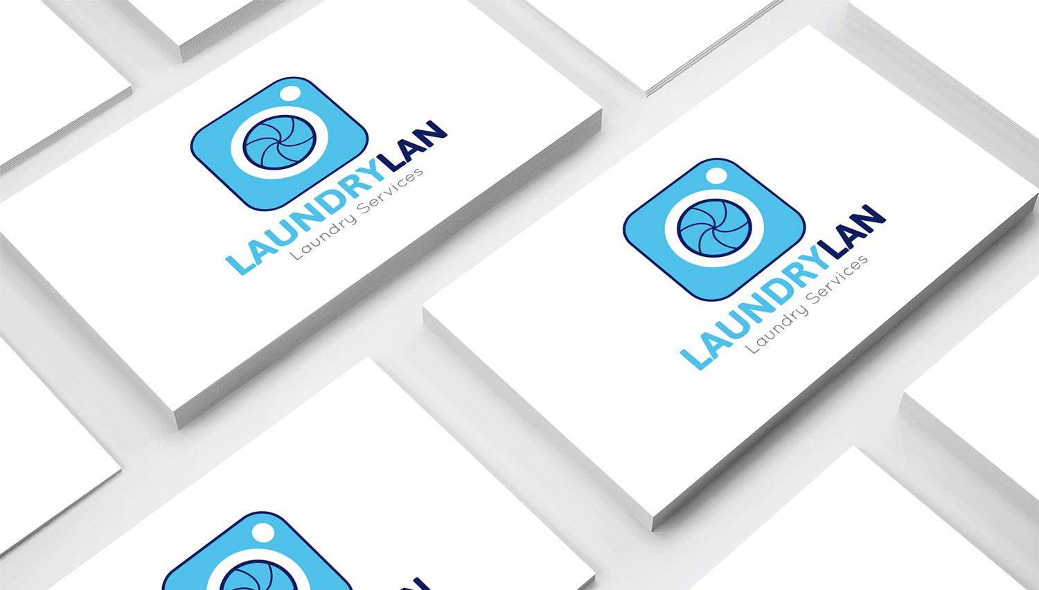
Collaboration with the Australian startup LaundryLan, a novel concept in the field of laundry, which has been successfully implemented in other fields. It is a market place for laundry services. For its development, different concepts were designed for user navigation on the web on different devices (phone, tablet and computer), as well as other media, such as cards or Power Point presentations.