
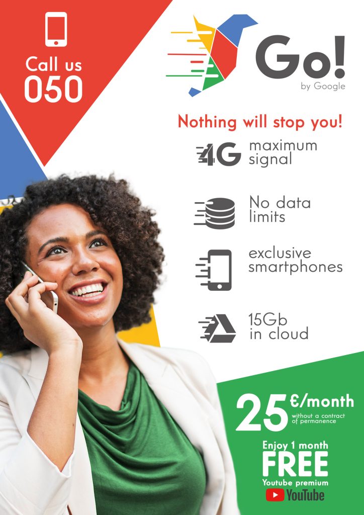
Go! was born from a personal naming and corporate image development project in which Google launches to the market as a new virtual mobile operator. It focuses on young people between the ages of 18 and 40 who are looking for an efficient service, who are willing to pay a little more for quality services. Features that focus mainly on the speed of its connections and a sophisticated service.


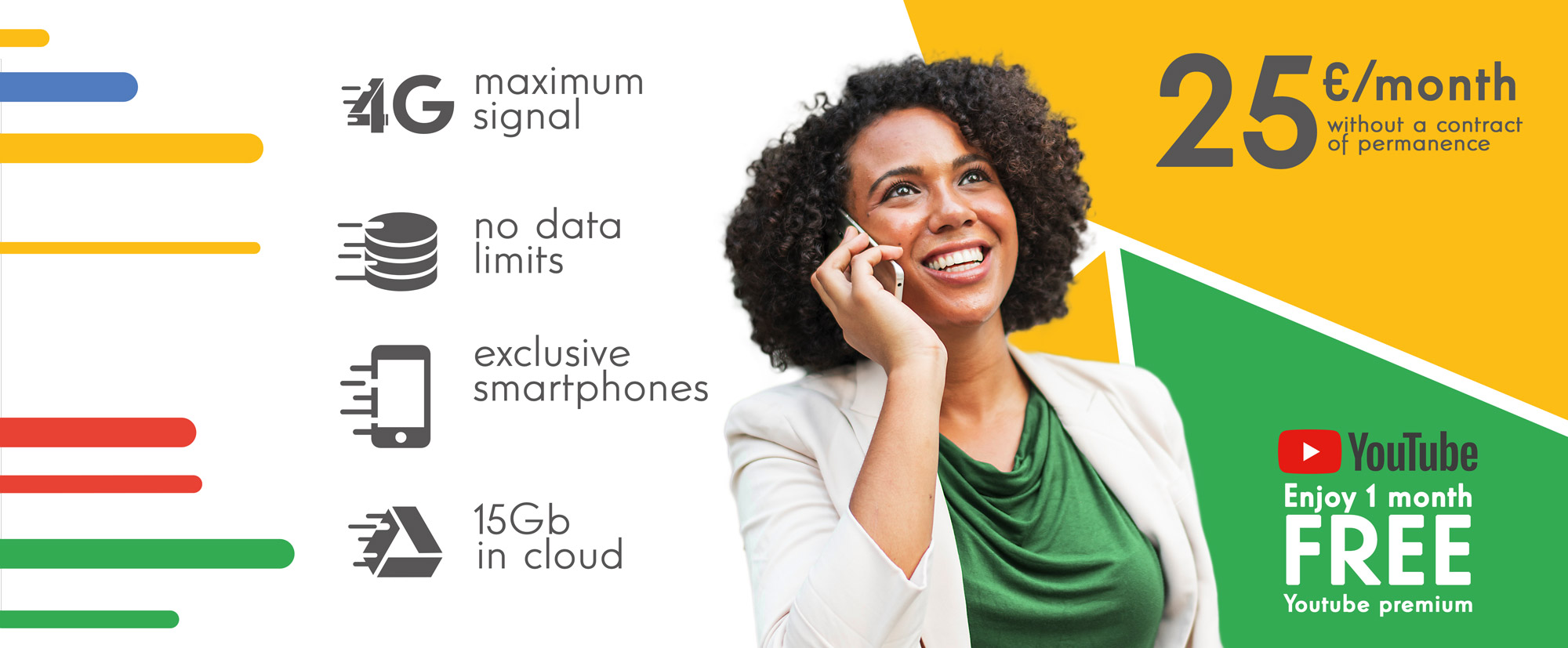
The name Go! is born from the philosophy of the service offered and the public to whom it is addressed, young people with ambition who are always looking to improve, to continue progressing and for this they make use of technology. They are looking for a service that ensures a smooth and high speed connection, that does not make you suffer long waits to get the information you need.
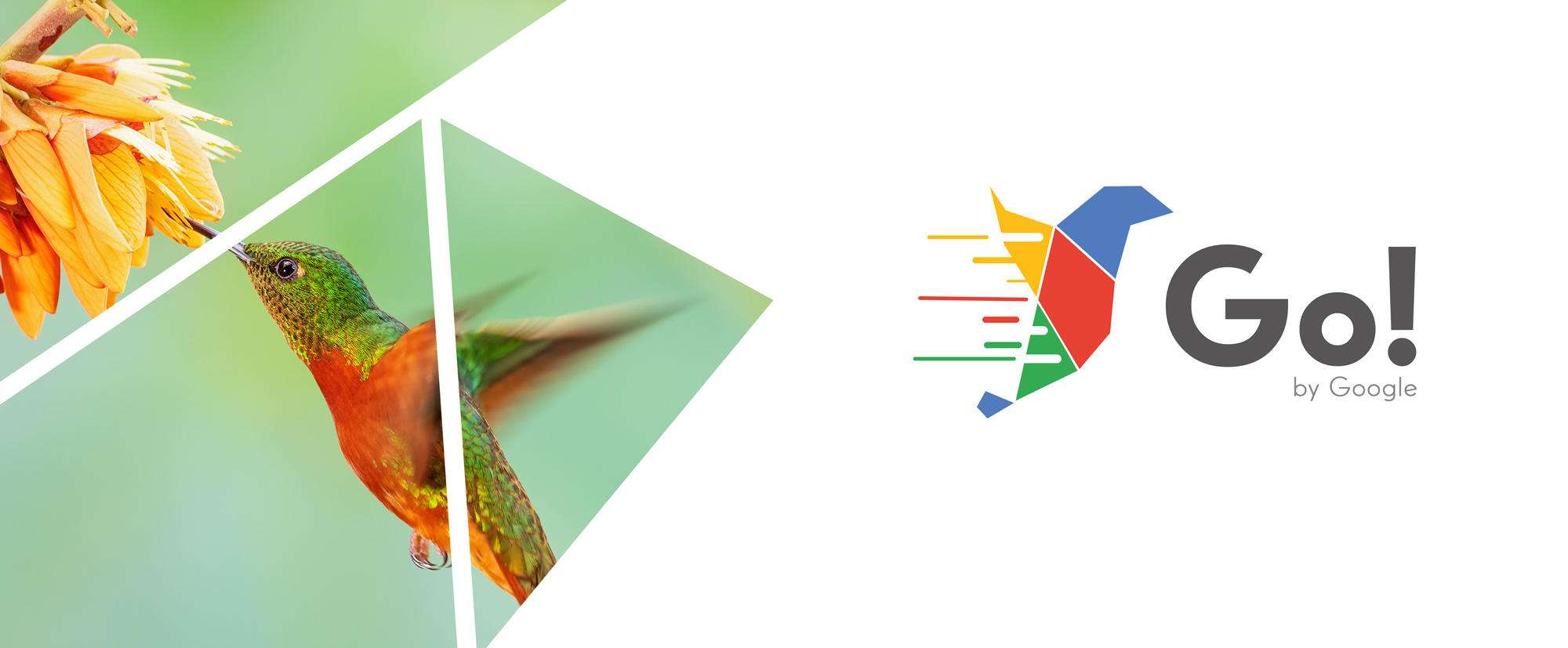
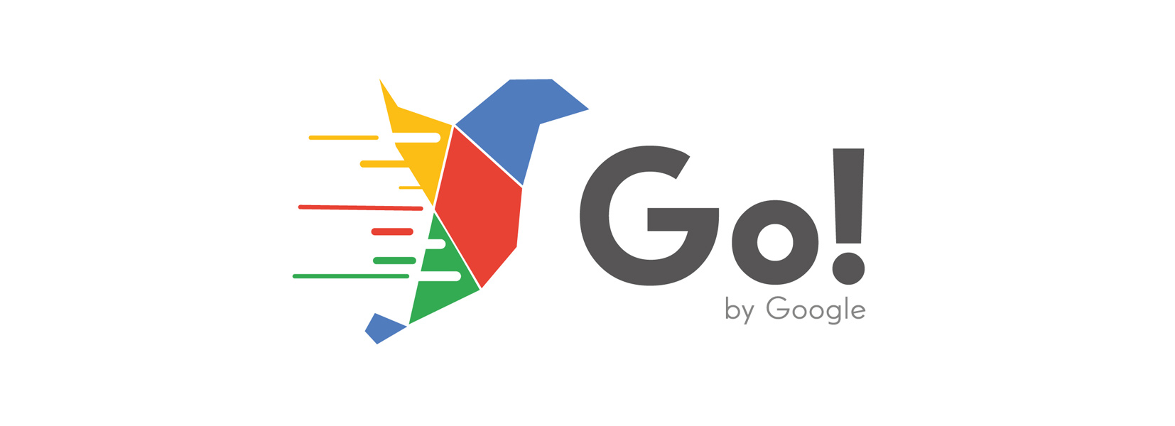
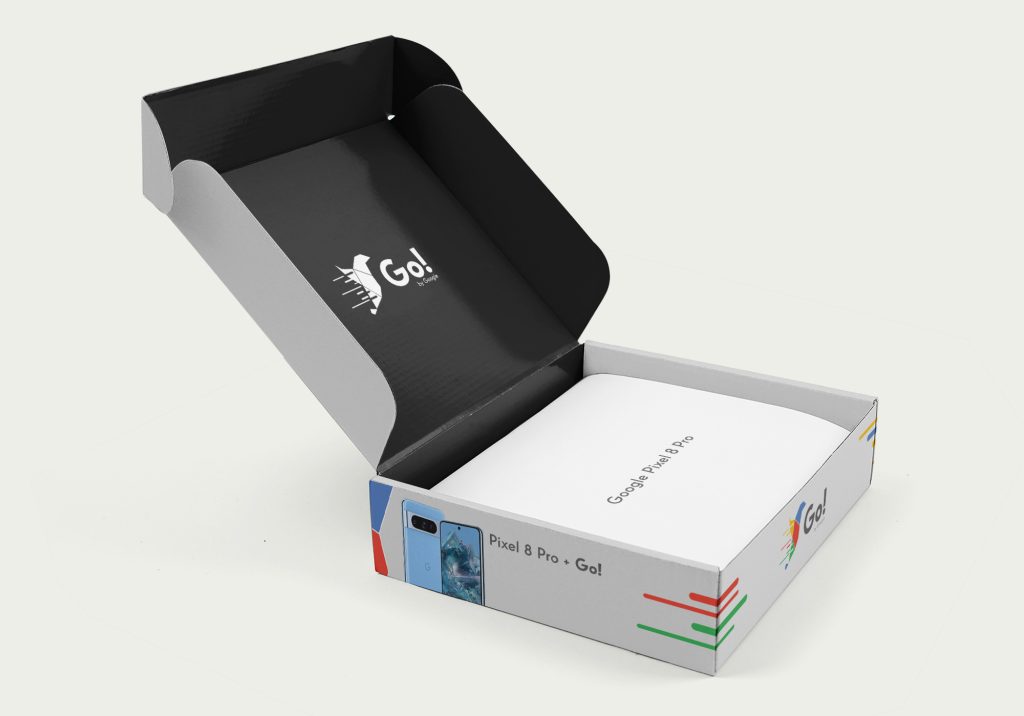
Go! is a short and easy to remember name, following the structure of its parent company “Google” that conveys speed, progress and the desire to eat the world.
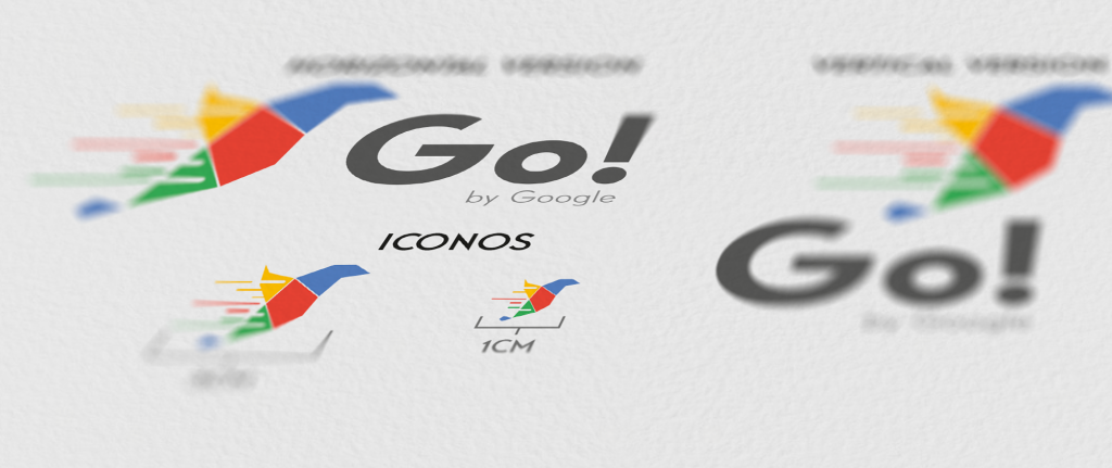
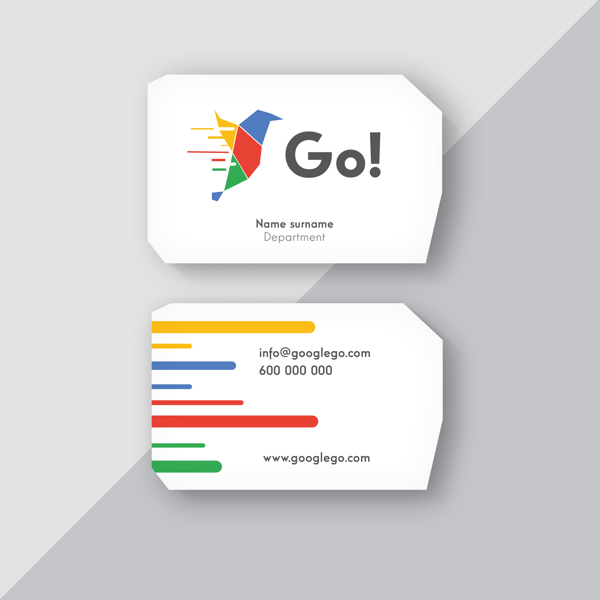
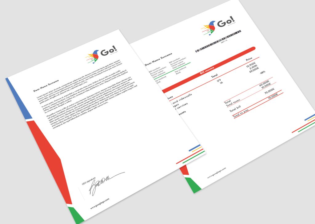
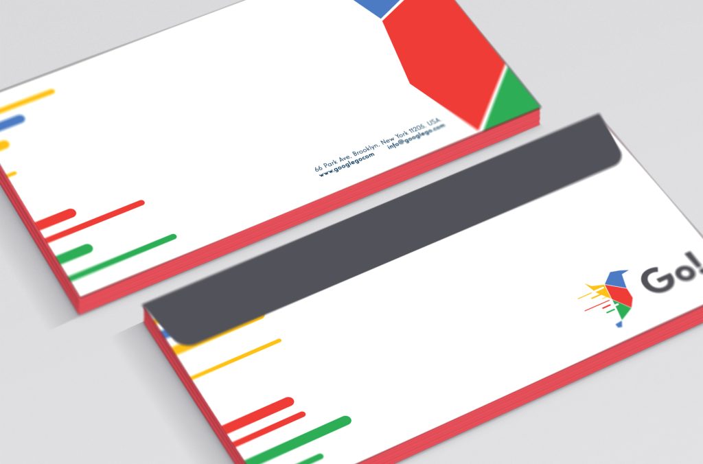
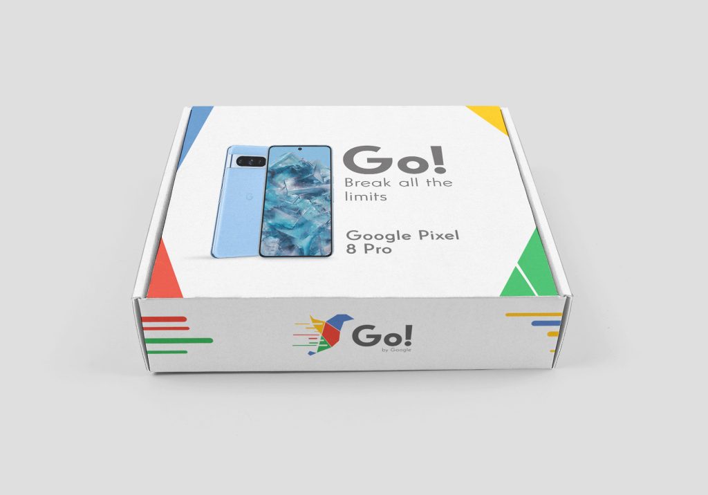
An iconography is created following the graphic line of the logo, of the services offered by the mobile virtual network operator, such as Wifi, storage, smartphones, etc…


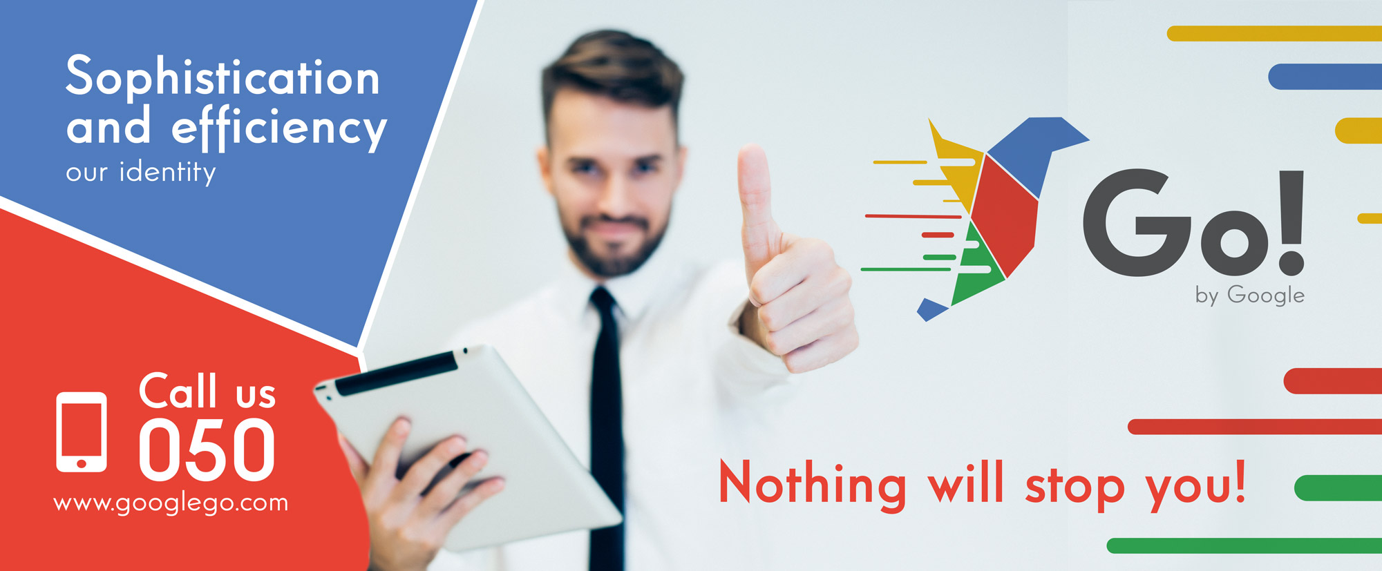
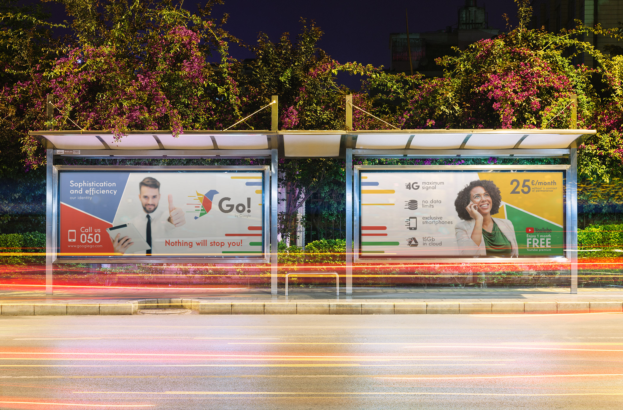
Personal branding project, developing the brand proposal for a new Google service. This time it is the new virtual mobile operator Go!, standing out from its competition the speed offered in its connections and the sophistication of the service offered.
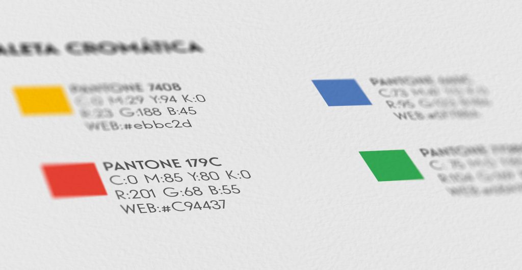
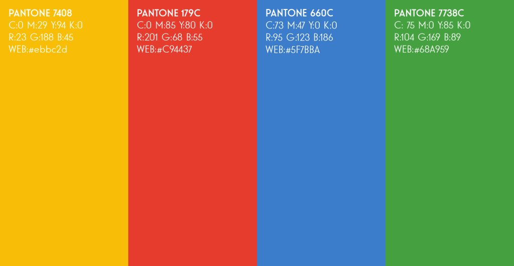
The typography and colors used in other Google products are maintained due to their distinctive character in the market. The chosen anagram reflects very well the essence of the service offered (Sophistication, speed and innovation). From this point the different graphic supports are created, such as corporate stationery and different advertising contact points, maintaining a tone of communication aimed at young, enterprising people, of medium/high economic level who put the quality of the service before the price.